Eggschange
Everyone's a Teacher
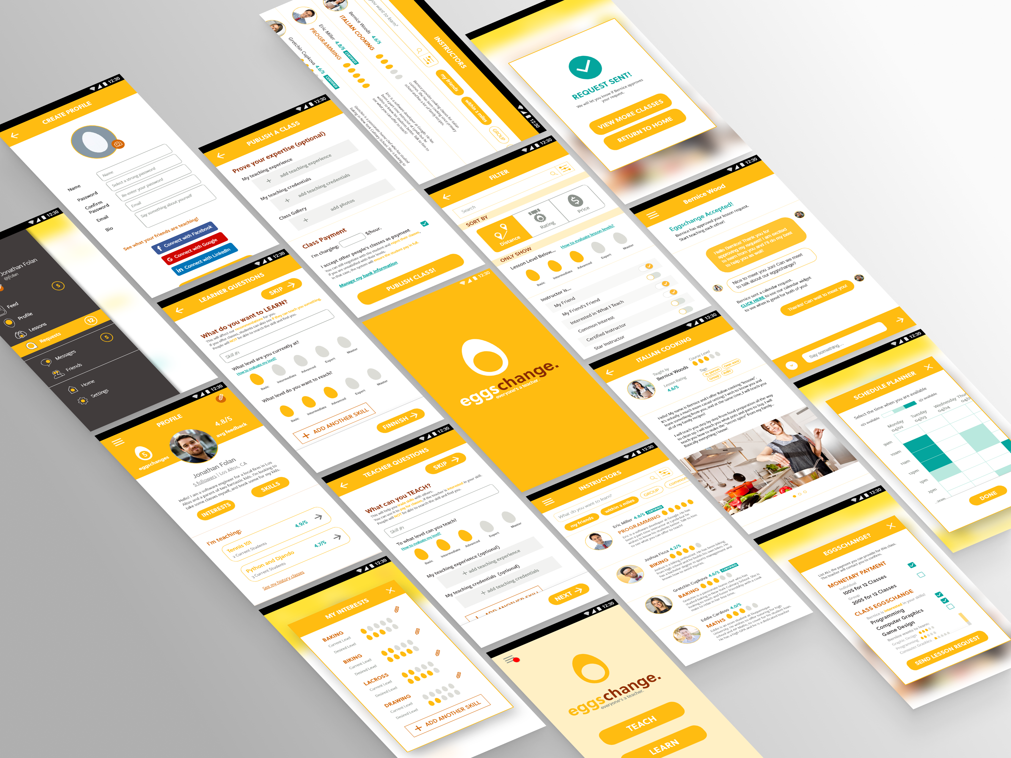
Fully-fledged class project from UX research to UI design. Led the screen design and final mockup generations. Received 2nd place in class rankings.
User Study
In this project, our team developed a mobile application prototype for peer-to-peer teaching, allowing students to pay for lessons by trading skills and becoming each other's teachers, in addition to conventional monetary payments.
We inherited another team's research for P2P teaching. (Correspondingly, my team did a research on tool-sharing and passed it on to another team for app design). After going over the research data, we decided to focus on three main goals:
Improving mutual trust between teachers and students. Since mutual teaching typically occurs among friends, we aimed to extend this trust to a larger user base.
Encouraging people to verify and demonstrate their expertise. Users need to be convinced of the teacher's expertise before committing to learning from them. We then need to foster trust through clear and reliable screen designs.
Incentivizing individuals to accept lessons as a payment. While monetary payment is expected, we aimed to cultivate a community that values mutual teaching across diverse backgrounds.
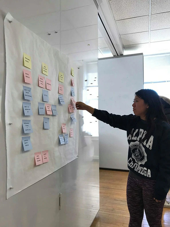
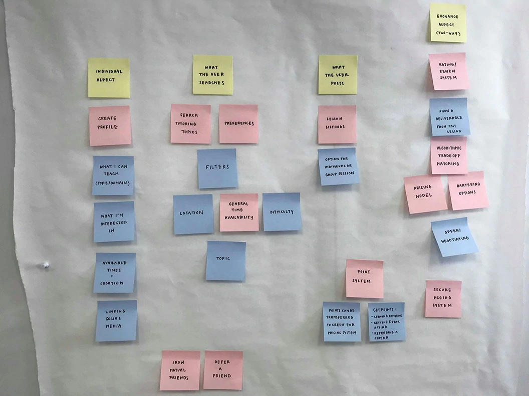
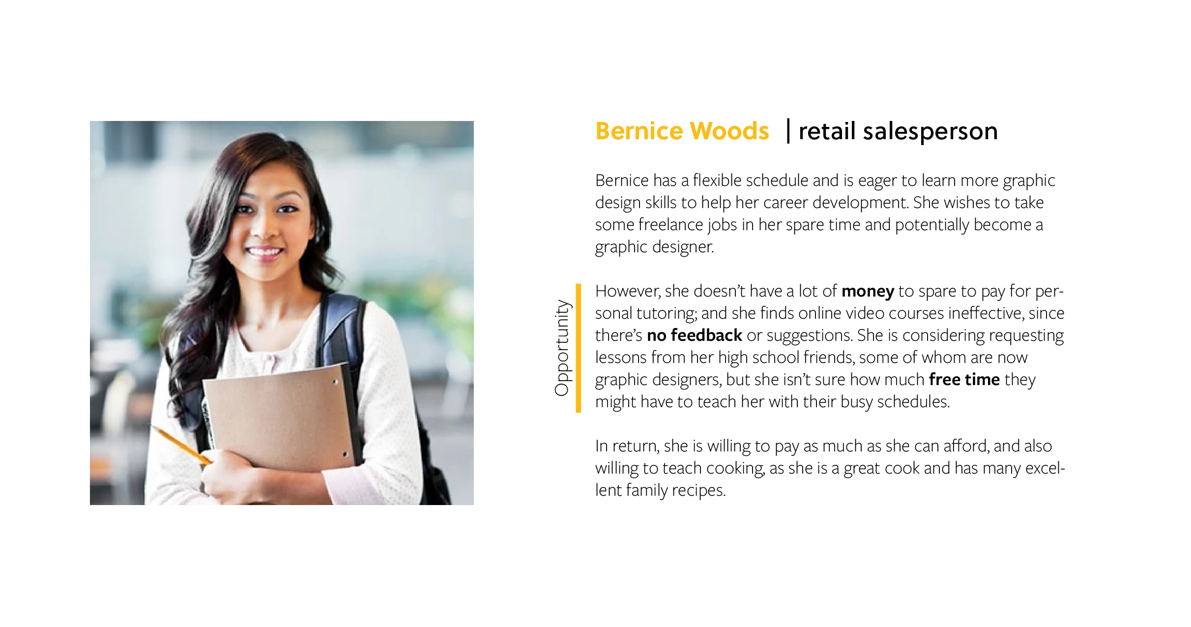
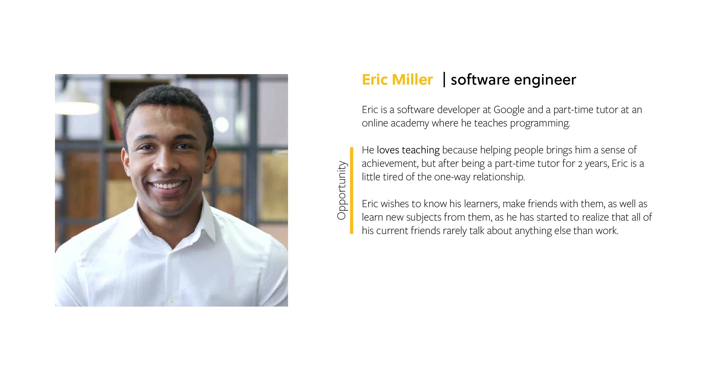
We synthesized the problem space of peer-to-peer teaching, quickly generating and merging personas and scenarios to guide our design process effectively.
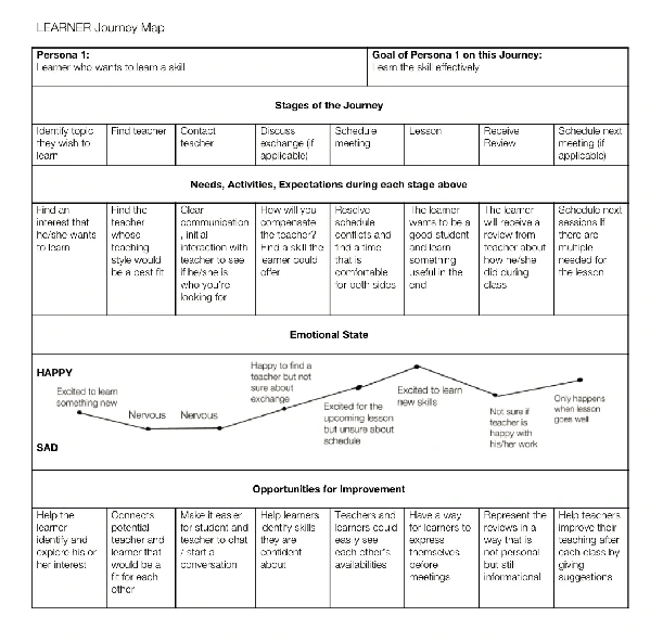
Personas
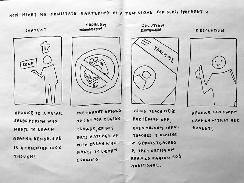
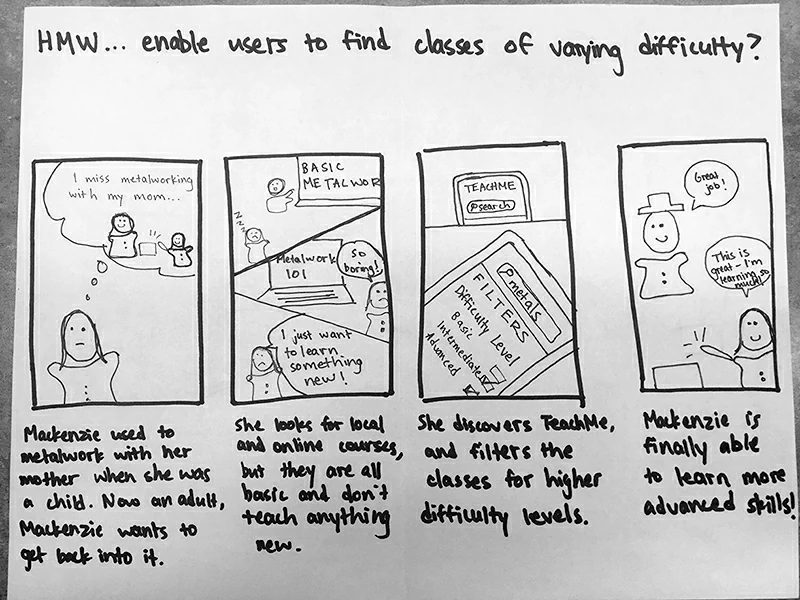
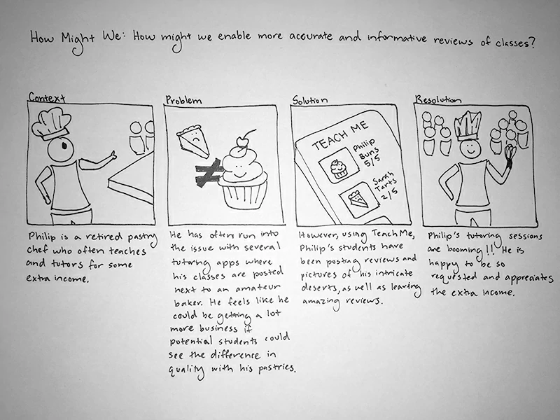
Scenarios and Storyboards
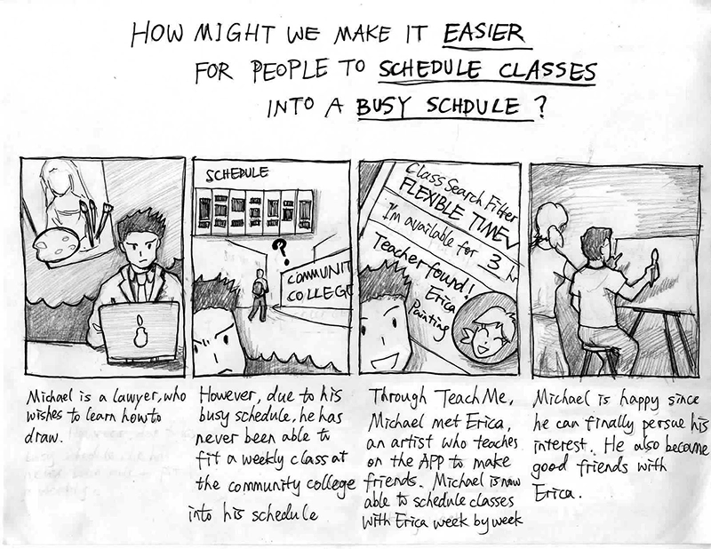
Scheduling Scenario (Samson, AKA me!)
Michael, a middle aged lawyer, has always wanted to learn about drawing. Unfortunately, between his job and his family, he has never been able to find the time to take a weekly class at the local community college, as his schedule changes based on the case he is working on that week. However, Michael discovers the app TeachMe, where he met Erica, an artist who teaches on TeachMe as a side gig. With the scheduling app in TeachMe, Michael is able to schedule classes week by week whenever he is free based on Erica's availabilities and is finally able to learn how to draw.
Prototyping and User Testing
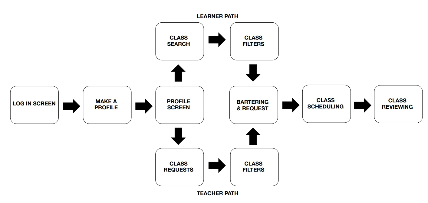
With our storyboards complete, we created a user flow to outline the rough prototype.
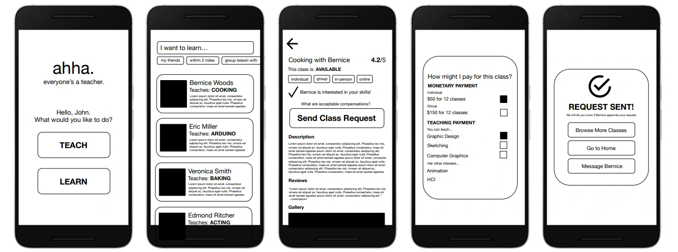
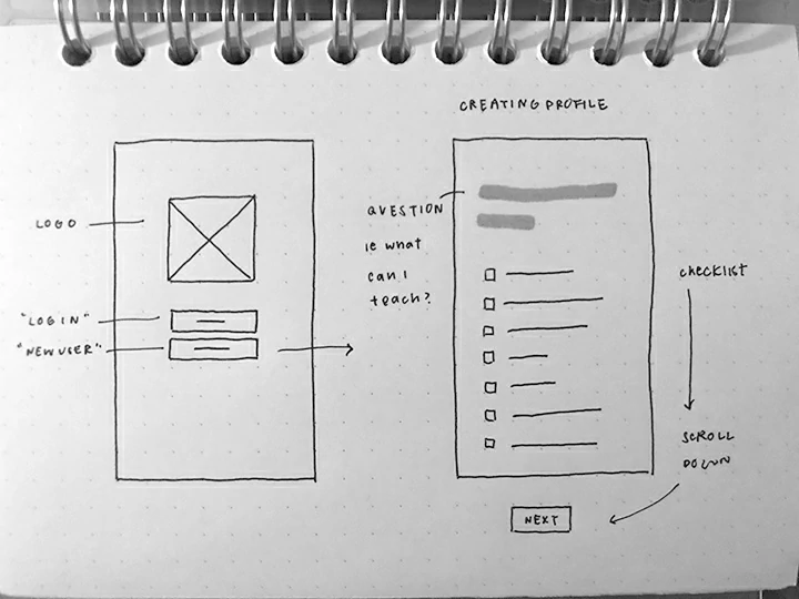
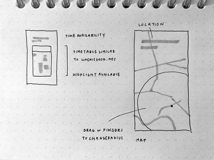
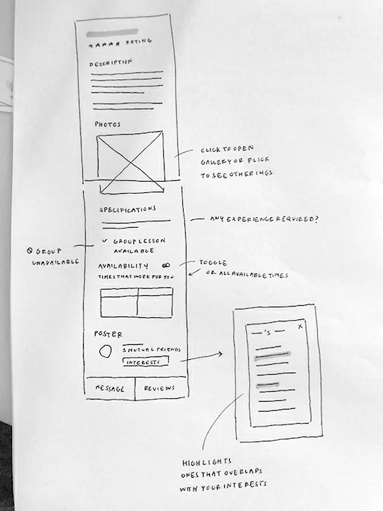
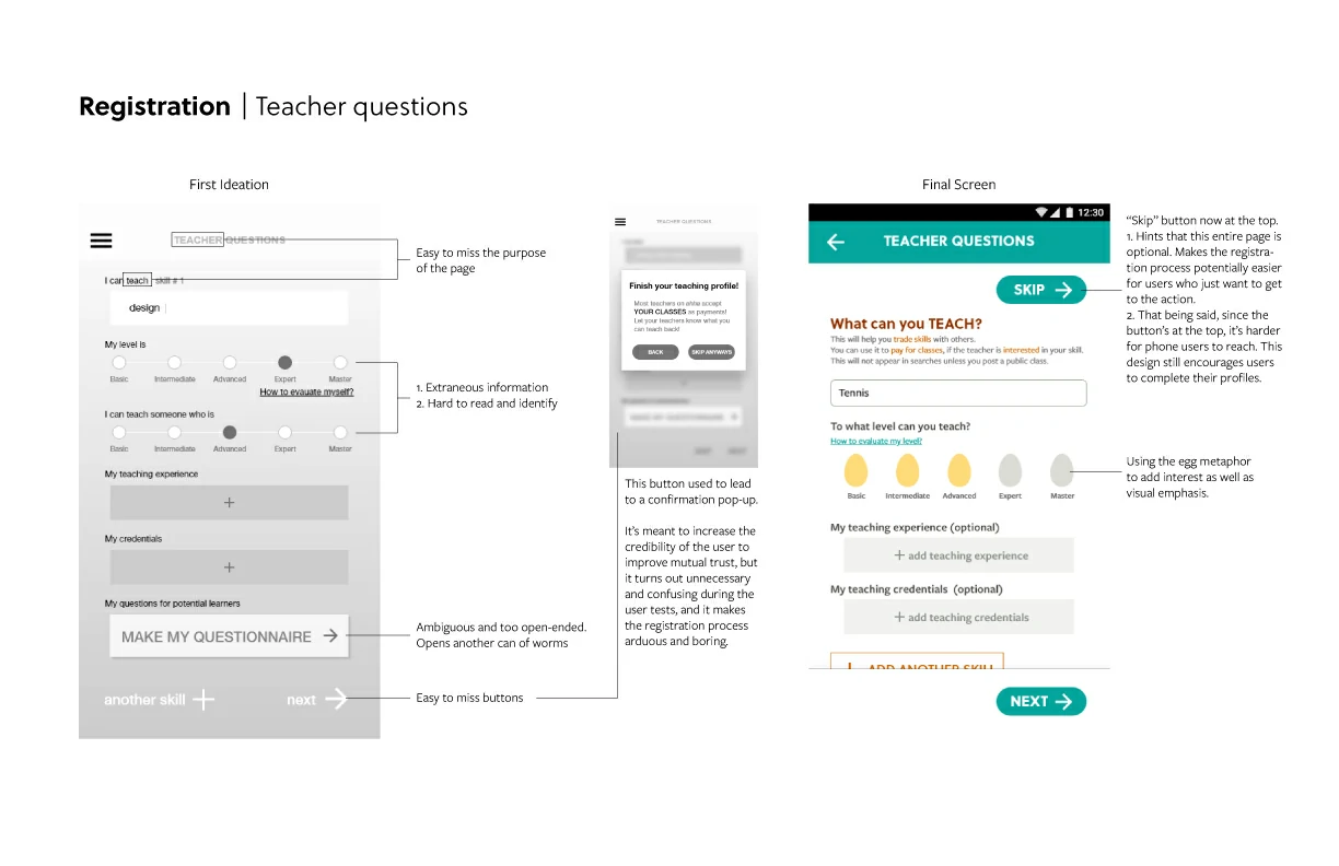
We then developed low-fidelity wireframes for a round of usability testing. To maximize feedback on UX, we used a very simple black-and-white format for the screens.
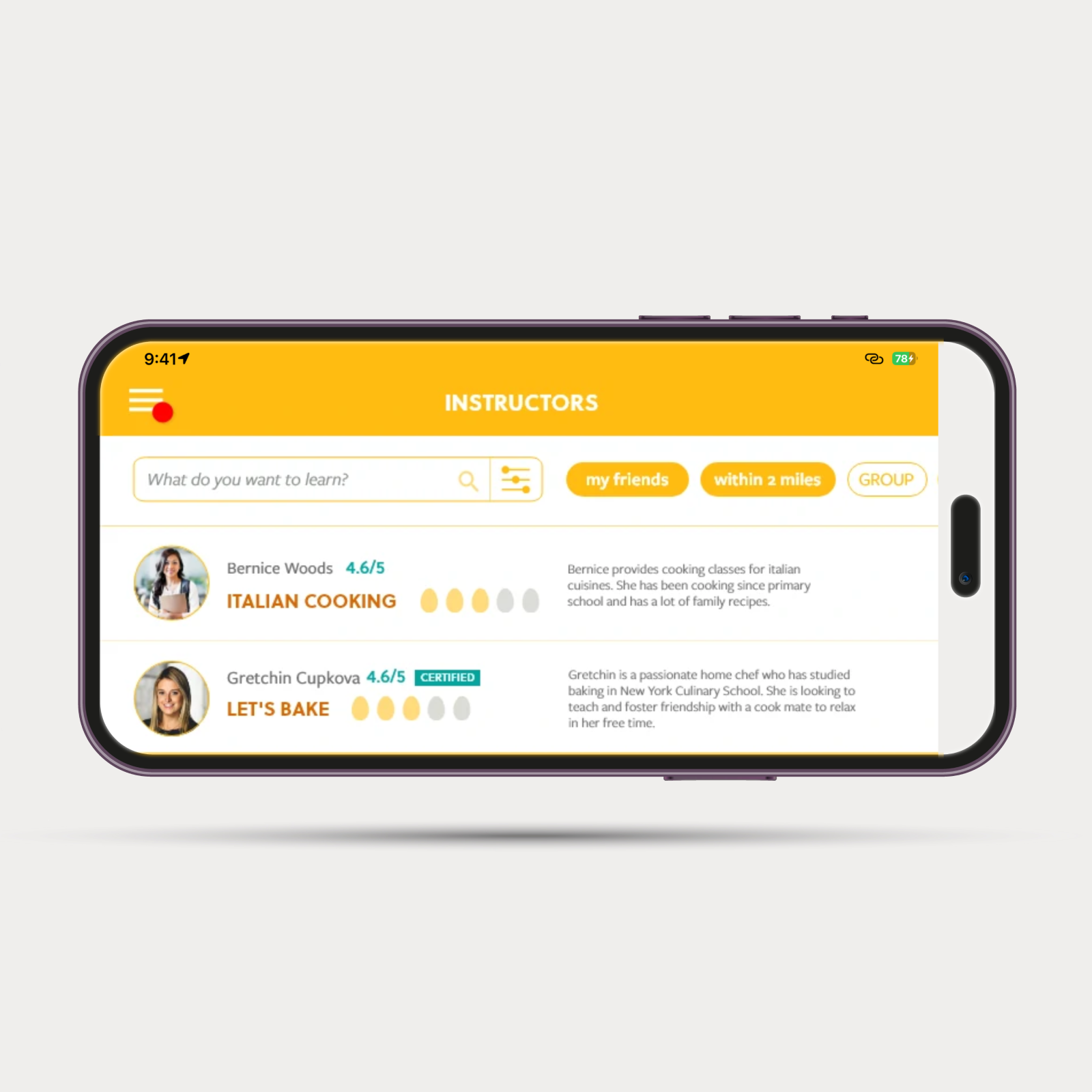
For the testing, developed a 10 screen click-through prototype. Users were asked to navigate the prototype to sign up, browse available classes, select a cooking class, review bartering options, and finally request and get approved for a class.
Some of the challenges we encountered:
Balancing quick registration with thorough profiles. We aimed for a swift registration process but also wanted users to upload proof of their expertise, which can be tedious.
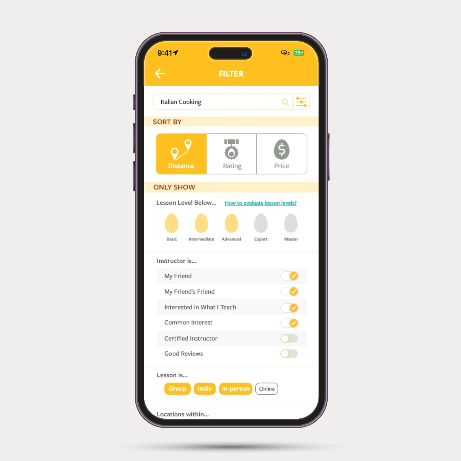
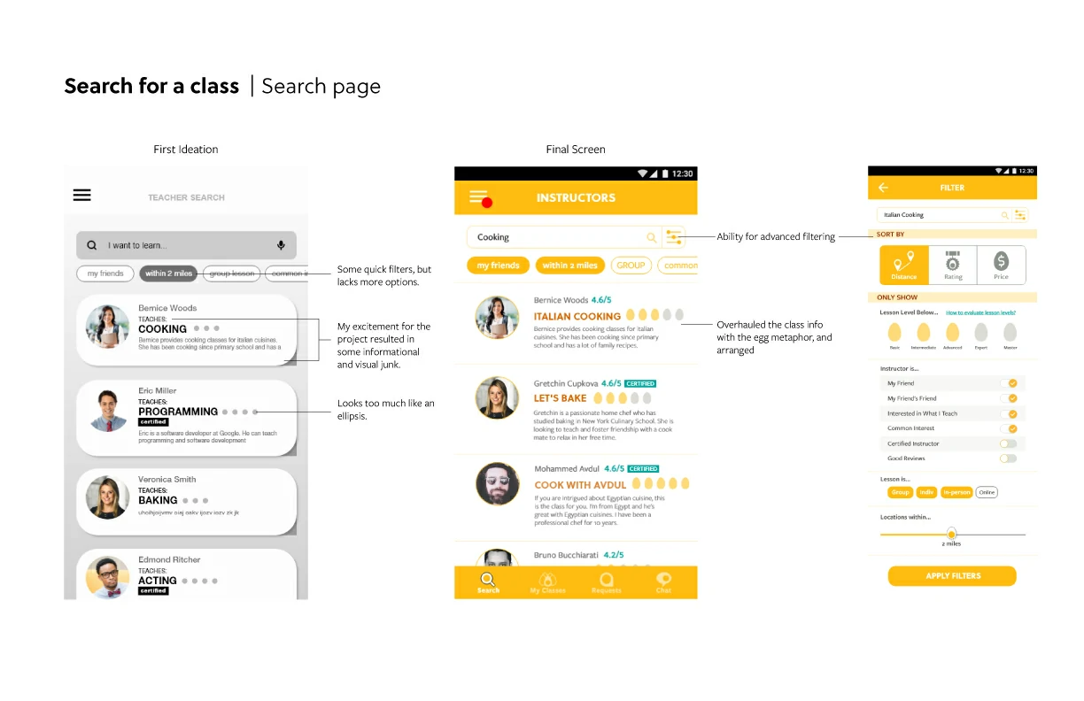
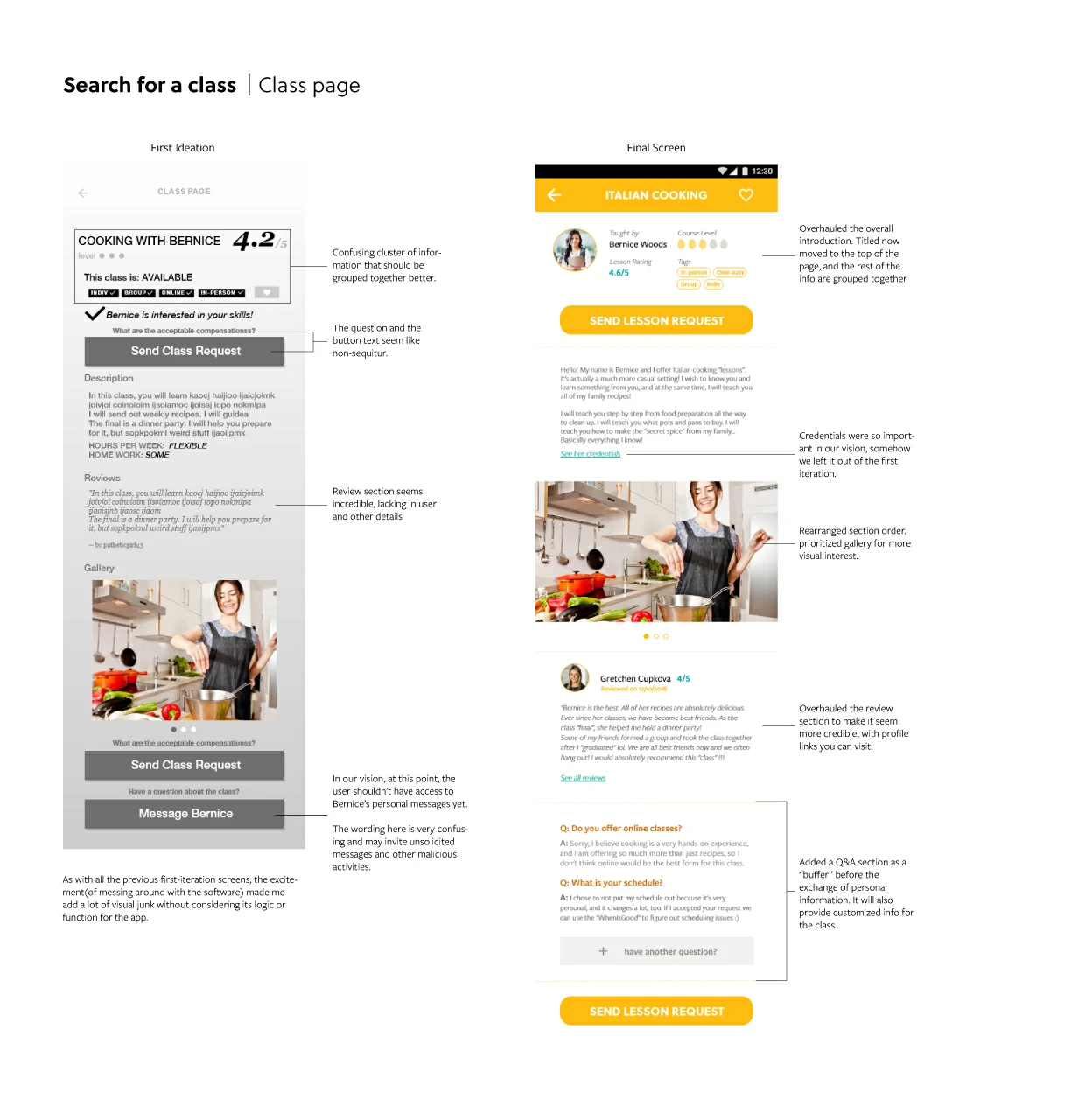
Overwhelming UI options. Many screens offered too many UI choices, leading to confusion.
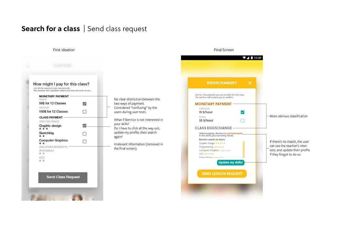
Managing varying willingness to share classes. Some users wanted to barter classes without making their own classes publicly available to everyone.
Hi-def Screen Design
After the user testing round, we tweaked our prototypes. Due to time constraints, we couldn't conduct another usability testing with rough prototypes. Instead, we reviewed all the issues and created a new rough prototype focusing on the crucial user flow problems, such as the login process with questionnaires and the bartering process. We planned to address UI clarity issues during the screen design phase.
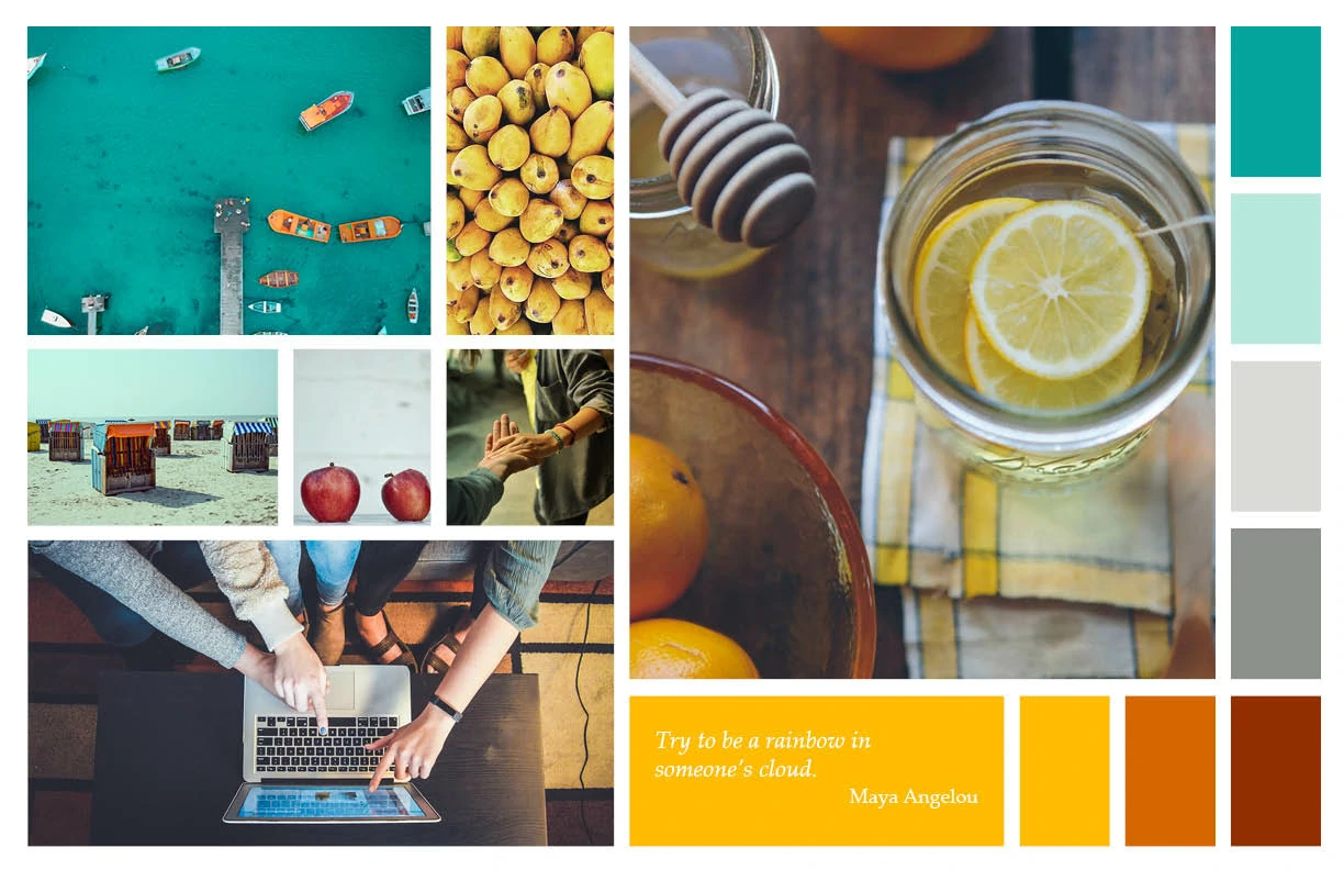
To kick off the design, we developed a mood board to capture the app's "feeling". We wanted to emphasize warm and inviting colors for public user actions, as well as chill and relaxed colors for private ones, settling on a palette of yellows and blues.
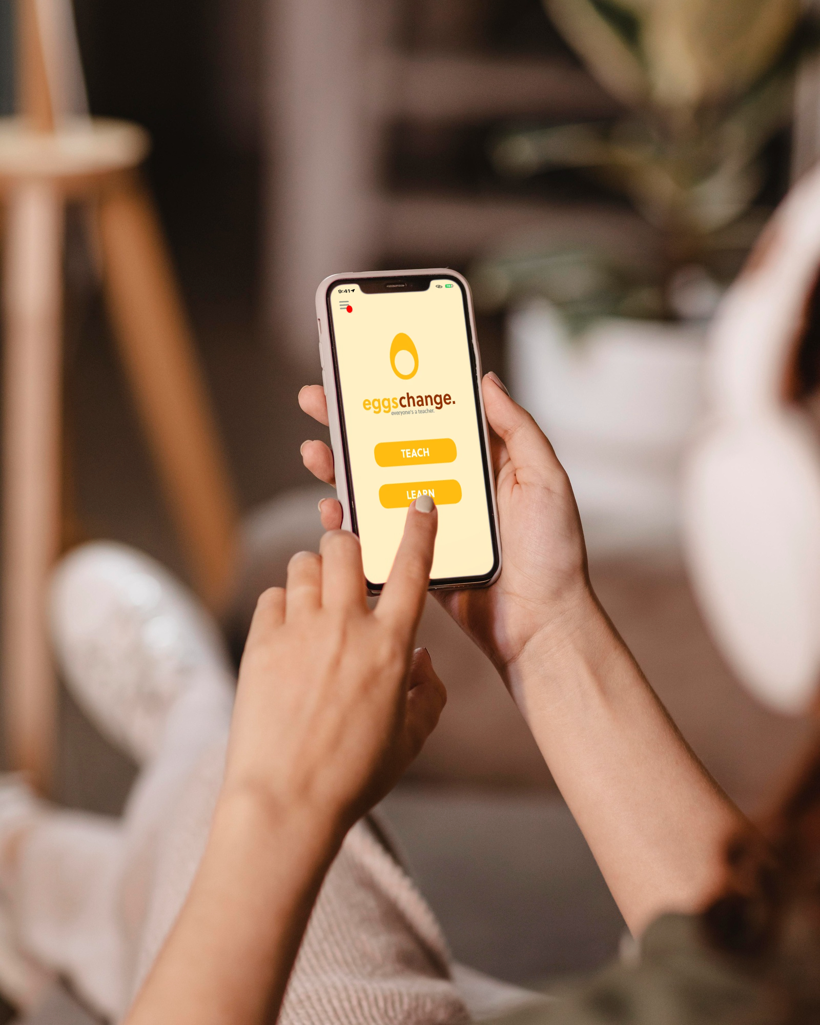
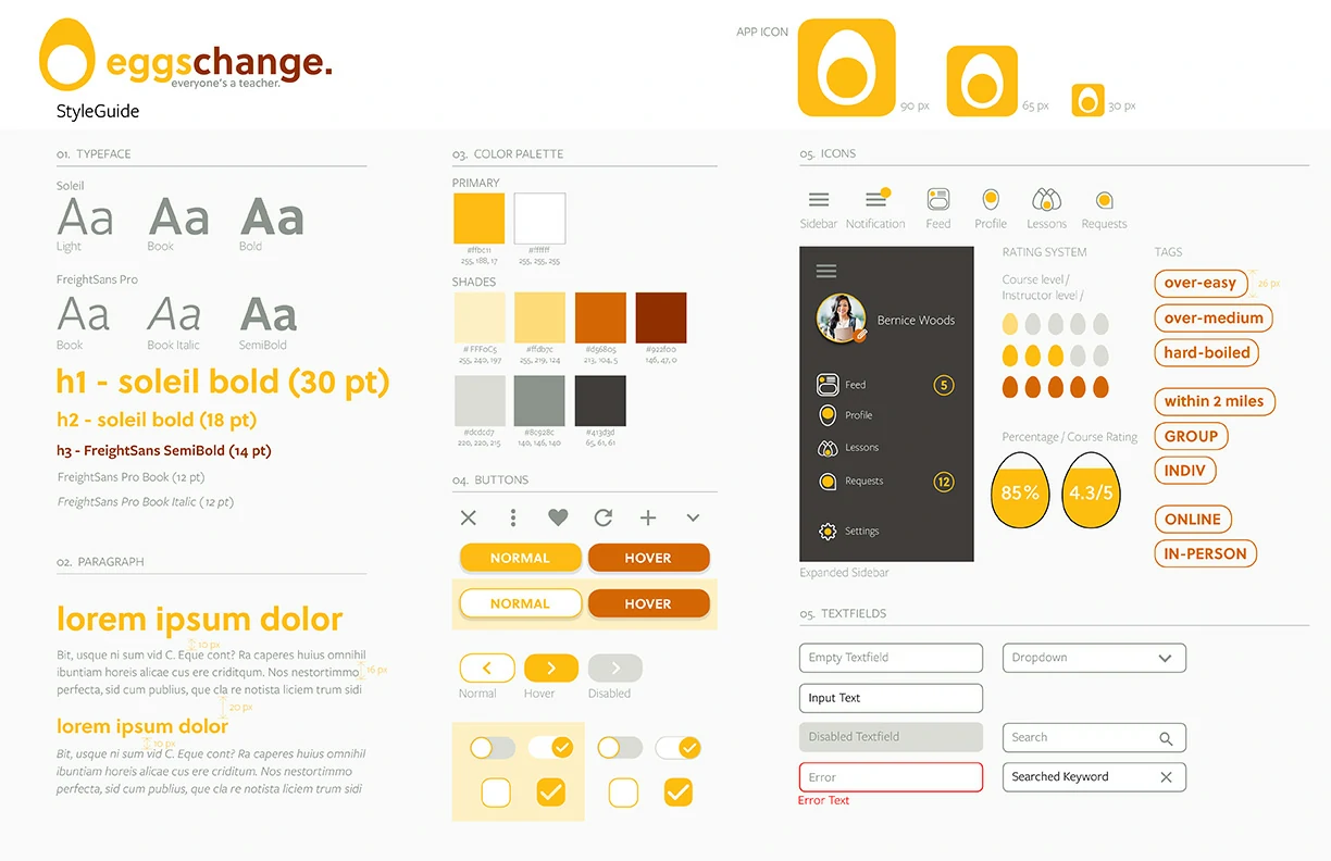
Inspired by our mood board, we created a style sheet. From the yellow color theme, we decided to name the app "eggschange.", symbolizing the exchange of knowledge. This name also inspired an egg logo, adding a whimsical touch to our design.
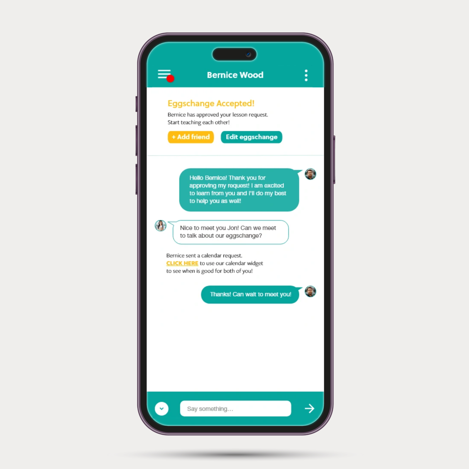
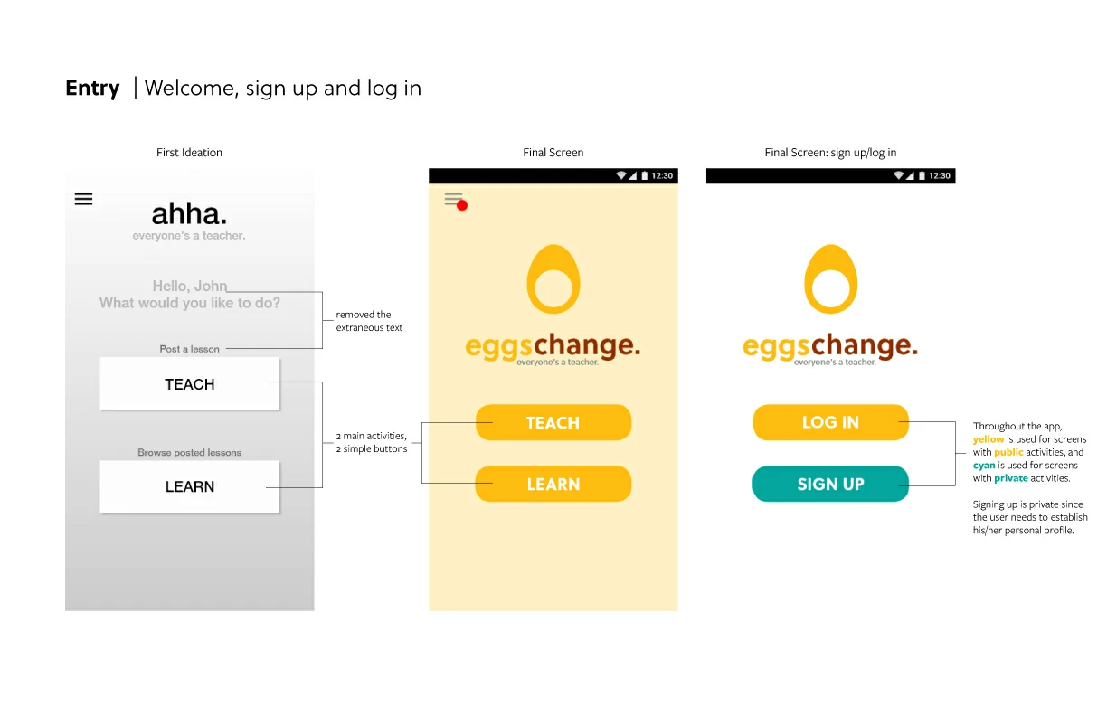
For the final screen designs, we ensured consistency across all screens while maintaining unique, compelling designs. The egg theme was incorporated throughout the app to add a sense of whimsy and humor, helping users feel more comfortable.
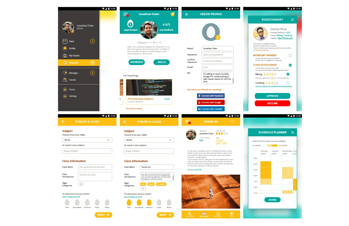
Interactive Demo
For this clickable demo, please consider these three tasks: Register for the Eggschange app. You can teach advanced tennis, and want to learn cooking.Post a class teaching advanced tennis. Joshua will send you a class request. Review the options and accept the class request.Find a class about italian cooking. Send a class request and decide on a meeting time with the teacher.
Pitch Presentation
Finally, with our designs complete, we created a presentation to pitch our application to the class. We useds dual screens, one for the prototype and the other for the presentation.
